Science and Technology Resources on the Internet
Maps for Health Metrics: An Epidemiology Resource Webliography
Rachel DeBoer
https://orcid.org/0000-0002-8954-8165
Physician Assistant
Madigan Army Medical Center
Tacoma, WA
MLIS Candidate, School of Information
San Jose State University
San Jose, CA
rachel.deboer@sjsu.edu
Susan Ward Aber
https://orcid.org/0000-0002-0428-7358
Lecturer
School of Information
San Jose State University
San Jose, CA
sjsu.abersusie@gmail.com
Abstract
Maps have a long history of being used as sources to track disease outbreaks, link causes and effects of disease, combat misinformation, present ideas and improve patient care. This webliography is a compendium of thematic maps, including health metrics, risk factors, infectious diseases, cancers, chronic diseases, and psychiatric disorders. Maps were gathered after evaluating data for reliability and currency. These selective epidemiology resources may aid public health professionals, medical practitioners, researchers, and librarians, who serve an information-seeking clientele interested in health-related quality of life.
Recommended citation:
DeBoer, R., & Aber, S. W. (2022). Maps for health metrics: An epidemiology resource webliography. Issues in Science and Technology Librarianship, 100. https://doi.org/10.29173/istl2694
Introduction
Epidemiology is a medical research method that focuses on spread and control of disease with a goal of disseminating and implementing relevant findings quickly to inform healthcare professionals, medical practitioners, and policy-makers (Neta et al., 2018). Epidemiologists study disease using an evidence-based approach to health metrics, which are the identified variables that quantify and impact Health-Related Quality of Life (HRQOL) for individuals and communities. According to the Centers for Disease Control and Prevention (2018), HRQOL is “an individual’s or group’s perceived physical and mental health over time,” including risk factors and self-reported chronic diseases (para. 4). “Health metrics are measured to recognize subgroups with relatively poor perceived health... and guide interventions to improve their situations and avert more serious consequences” (para. 6).
The National Center for Health Statistics (NCHS) reported, “In 2020, life expectancy at birth for the total U.S. population was 77.3 years, declining by 1.5 years from 78.8 in 2019” (Arias et al., 2021). This is the largest decline in U.S. life expectancy since World War II (Leonhardt, 2021). It is in part attributed to COVID-19; a disease caused by the SARS-CoV-2 virus. This type of coronavirus created a multi-year global pandemic. Statista (2022) reports that in the US, from January through March, 2022, COVID-19 continues to be one of the most prevalent causes of death along with heart disease, cancer, accidents, stroke, respiratory disease, and Alzheimer’s disease. In addition to mapping the spread of COVID-19 and tracking provisional death counts in the US from January 1st, 2020 to present, epidemiologists at the Centers for Disease Control and Prevention (2022) provide daily updates on vaccination coverage and effectiveness, creating maps and charts from data down to the county level. Health professionals use this visual information to make recommendations and take action to control the disease on a national to community level. This serves as an example of the importance of maps to disseminate the work of epidemiologists.
Epidemiology & Mapping
Epidemiology serves as the foundation of public health and its preventive healthcare initiatives. Epidemiologists gather data on incidences, distributions, patterns, determinants, and other factors associated with health, longevity, and quality of life. Some of these factors are known, like the effect of smoking on asthma, and some are still being discovered such as the cause of multiple sclerosis. Medical epidemiologists have long been on the hunt for these connections and a way to easily visualize statistics. One physician led the way by using maps to end a London plague and he is often said to be the father of medical epidemiological mapping. John Snow, a physician in 1850’s London, discovered the source of a cholera epidemic by mapping the houses where patients with cholera lived. The cholera cases were found to be centered around a contaminated water pump. The water pump handle was removed and new cholera cases in this part of London ground to a halt (Musa et al., 2013). Snow’s example of epidemiological mapping is likely the first thematic map using health metrics and was vital in improving the quality of life in the 19th century.
Thematic maps are the ideal graphical tools to convey health-related data and add the spatial component. Maps visually connect data to geographic locations, help to communicate information patterns, track changes over time, and predict outcomes for healthcare initiatives. Subsequent analysis leads to correlations and provides new insights into preventable diseases and injuries. Maps monitor the nation’s public health objectives, with COVID-19 maps serving as local and global examples.
Advances in Mapping
As our understanding of diseases and mapping tools have advanced, patterns of disease and risk factors emerge in ways not seen in the past. Wartenberg (2003) discusses how the advent of data technology in the 21st century allows medical epidemiologists to look at data in new ways by generating and assessing new risk factor-disease hypotheses and associations (p. S85).
Special mapping techniques using Geographic Information System (GIS) technology allow data to be turned into pictorial representations that can be layered. Being able to superimpose maps on top of each other, helps to visualize the way diseases spread and make potential disease correlations. These layered maps reveal reasons for health disparities among diverse populations and how best to care for the populations they affect. GIS mapping helps forecast what improvements will be most beneficial and aid in measuring success or failure. Trends in data are easily visualized as mapping becomes more sophisticated. The value of adding a temporal unit to mapping has allowed GIS tools to take great steps forward in medical epidemiology (Musa et al., 2013). Also, Web GIS has the capability to create static or interactive maps and allow maps to reach wider audiences.
Thematic Map Projections
Map projection types are utilized to minimize the effect of the distortion when transforming from a 3-d surface to 2-d map. It is important when reading a map to remember that “much like peeling an orange, the curved surface of the Earth cannot be made flat without distorting it in one way or another” (Aber & Aber, 2017, p. 58, 3.3). Various projection types help to minimize distortions, but no map can recreate a sphere on a flat plane and maintain perfect proportions.
As early as 1945, Jarcho reviewed limitations of map projections in epidemiology, specifically related to tropical diseases. Jarcho (1945) concluded that equal-area projections were superior to the commonly used Mercator projection for world maps of disease. Mercator projection maps may have accurate shape measurements at the low latitudes, yet land masses at the equator become disproportionately small as compared to countries closest to the poles that are stretched to larger proportions (Aber & Aber, 2017, 3.3). For example, Greenland appears nearly equivalent in size to the continent of Africa on maps using a Mercator projection. Greenland, in fact, is less than 25% of the size of the United States (MyLifeElsewhere, n.d.).
Field (2020) notes that people expect maps to tell an accurate story and not misguide or misinform the viewer. Thus, in addition to choosing the best map projection to portray global geographic data distribution, map symbology is important. Symbology techniques serve to represent information using layers of colors, shapes, and symbols on maps. Medical epidemiology maps most often use choropleth symbology, but dot density, proportional symbol, cartogram and heat maps are also used.
Common Map Symbology
Choropleth maps are color-coded according to a particular range of values for a defined variable. This symbology is commonly used because the maps are intuitive and create stark contrasts. Disadvantages of choropleth maps are difficulty in distinguishing between various shades of color and in interpreting shaded units at arbitrary boundaries, such as state lines.
Dot density maps use a dot for each unit of value. The main disadvantage of this symbology is that overlapping dots may coalesce into unreadable blobs. Whereas, proportional symbol maps create shapes of varying sizes based on assigned values. For example, circles overlying a map representing the values of 10, 100, and 1,000 would be proportionally small, medium, and large in circumference.
Cartogram symbology greatly distorts the geometry of the underlying feature. For example, mapping a state’s hospitals of a geographically small county could appear huge on the map given a large number of hospitals; in contrast, a larger county, with fewer hospitals, will appear small and inconsequential. While cartograms are sometimes difficult to read, they are a powerful technique at showing disparities between areas (Aber & Aber, 2017, p. 23, 2.8).
Heat maps are used when trying to represent a generalized view of numeric data. Typically, a darker or hotter hue, like red, is used to represent a higher number or a more condensed area of the subject. In contrast, a lighter hue or cooler color is used to represent a lower number or a less condensed area. By using this gradation technique, large volume trends can be easily displayed and understood. However, Bojko (2009) cautions that map legends must be reviewed, because heat maps that seem intuitive, are not always interpreted correctly. An example of a heat map would be clouds moving across a doppler weather map, where clouds that are denser have a darker blue than clouds that are less dense, holding less water, would be portrayed in a lighter hue of blue.
With symbology in mind, simple choropleth maps dominate in epidemiology. Cartographers still use other geographic representations to present data. Field (2020) suggested “proportional symbol, log scaled, with a light to dark color scheme to accentuate the symbols” was best (para. 27). In contrast, Soetens et al. (2017) suggests dot map cartograms are best as they minimize misinterpretation, protect privacy of cases, and do not require GIS software. Soetens et al. also recommends choropleth maps for surveillance data, which is the systematic collection, analysis, and dissemination of data in epidemiology research (Discussion section, para 4). Yet, there is no one right map symbology to choose for all data. For a thorough overview of epidemiology mapping see Cartographic Guidelines for Public Health from the Centers for Disease Control and Prevention (2017).
Map Interpretation
Given maps with appropriate projections and effective symbology methods, epidemiologists may find relationships in data, which can be exciting. However, as Altman and Krzywinski (2015) explain in their article, Association, Correlation and Causation, while correlation is sometimes an association, it takes much more diligence to prove that correlation is causation. “When the number of features is large compared with the sample size, large but spurious correlations frequently occur” (para. 14). Conversely, with a large number of observations faulty conclusions may occur because…“ small and substantively unimportant correlations may be statistically significant” (para. 14). This can also be observed when maps are created to display dichotomous types of data such as choropleth or cartogram maps. These maps are good at displaying data clearly, but cannot account for other influencing factors that are not displayed on the map.
Not only is it important when reviewing maps to be cognizant of dubious correlations, it is also important to be aware of the issues when comparing indices between different counties, states, or countries. Not all geographic areas have access to the same tests, diagnostics and capacity to record information. Much of the data that was gathered to create these maps has taken these anomalies into account. Although the maps chosen have the best available figures, no cache of data is without error.
Scope and Methods
Medical science encompasses a wide range of topics and changes quickly. Some topics like influenza in the United States have updates that are available weekly, other topics like global cancer rates are available in 5-year increments. This webliography is a sample of mapped health data available for the categories: Health Metrics, Risk Factors, Diseases, and Disorders. These categories were determined to be the most accurate and commonly addressed risk factors and diseases. Some of the categories such as depression and dementia are more esoteric in definition and were difficult to obtain concrete and comparable data. However, because of the impact these diseases have on society they were included as well.
The maps were compiled using the Swisscows search engine, the Google Images search function and Google Scholar. Inclusion criteria were maps created by the U.S. government, well regarded non-profit organizations’ research, peer reviewed journals and secondary sources that used data created by one of the previously mentioned resources. Every effort was made to have a representation of global and U.S. data displayed in maps. The data was checked against other similar mapping data. When multiple maps were available with similar information the most up to date and clearly visualized maps were chosen. These epidemiology map resources were specifically selected to aid public health professionals, medical practitioners, researchers, and librarians, who serve an information-seeking clientele interested in health-related quality of life.
Organizational Structure
The epidemiology map resources in this webliography are divided into six medical topics: Health Metrics, Risk Factors, Infectious Diseases, Cancers, Chronic Diseases, and Psychiatric Disorders. Each medical topic has several related subheadings with global and U.S. thematic maps presented in Table 1. The website title and publishing organization for each resource is followed by an annotation and description of the map content.
| 1. Health Metrics: | 1.1. Life Expectancy |
| 1.2. Health Expenditures | |
| 1.3. Happiness Index | |
| 2. Risk Factors: | 2.1. Obesity |
| 2.2. Food Insecurity | |
| 2.3. Smoking | |
| 2.4. Alcohol | |
| 2.5. Water/Air Quality | |
| 2.6. Physical Inactivity | |
| 3. Infectious Diseases: | 3.1. Influenza |
| 3.2. COVID-19 | |
| 3.3 HIV | |
| 3.4. Lyme Disease | |
| 3.5. STI | |
| 3.6. Diarrhea | |
| 3.7. Malaria | |
| 3.8. Rabies | |
| 3.9. Fungal Diseases | |
| 3.10. Tuberculosis | |
| 4. Cancers: | 4.1 Cancer |
| 5. Chronic Diseases: | 5.1. Cardiovascular |
| 5.2. Diabetes | |
| 5.3. Asthma | |
| 5.4 Multiple Sclerosis | |
| 6. Psychiatric Disorders: | 6.1. Suicide |
| 6.2. Depression | |
| 6.3. Dementia |
Health Metrics: 1.1 Life Expectancy
1.1.1. Global Life Expectancy at Birth (Our World in Data)
Life expectancy simply stated is “the number of years a person can expect to live” (Roser et al., 2013-2019). People are living longer and longevity numbers have more than doubled worldwide. This is due to many factors such as medical innovations, vaccinations, antibiotics, public health interventions, improved sanitation, and funded healthcare.
Specifically, life expectancy data are estimates of the average age of death among a particular population group. This interactive choropleth map shows life expectancy from birth by country. It is one of many maps and charts taken from the detailed article, Life Expectancy. This inclusive map can be filtered from the year 1543, beginning in what is now the United Kingdom, to include all countries in 2019 (Figure 1.). This map also has a display for video progression of life expectancy through those years. The map indices are age of life expectancy roughly cataloged by decade. By hovering over each country, the name of the country, year of data collection and life expectancy are displayed.
Note. Image taken from Life Expectancy (Roser et al., 2013-2019). Used under Creative Commons Attribution (CC BY 4.0).
1.1.2. Global Life Expectancy at 60 years (World Health Organization)
This interactive choropleth map, created by the World Health Organization (WHO), shows human life expectancy after the age of 60 by country and can be accessed by clicking on the map icon  . The indices for this map are in years lived after the age of 60: <15, 15-19, 19-22, ≥22. This map can be filtered by gender, country and year (e.g., 2000, 2010, 2015 and “Latest”). By hovering over each country, the country’s name, year of data collection and life expectancy after age 60 are displayed. The importance of this map is that it helps to exclude infant and child mortality from adult mortality. The symbols on the upper left of the scatter plot display can be used to toggle between countries using the world map or scatter plot graph.
1.1.3. Global Healthy Life Expectancy (HALE) (Global Obesity Observatory)
This interactive choropleth map uses data from the World Health Organization and Global Health Observatory, to display healthy life expectancy, which is defined by a disability free life. The map indices are by years of age: <60, 60-67, and >67 for all adults. By hovering over each country, the country’s name appears and the age of healthy life expectancy for adults. A link to the 2021 data that were used to create this map is located under the map labeled “Source”.
1.1.4. U.S. Life Expectancy (Center for Disease Control and Prevention)
There are static and several interactive choropleth maps on this website. This allows the user to view life expectancy in the US by state, county and census tract 2010-2015. The map was created by the Centers for Disease Control and Prevention, using U.S. Census Bureau data from 2010-2015 and estimates produced in a collaborative project, U.S. Small-area Life Expectancy Estimates Project (USALEEP). This project involved the National Center for Health Statistics (NCHS), the National Association for Public Health Statistics and Information Systems (NAPHSIS), and the Robert Wood Johnson Foundation.
The indices are displayed in average age of death per state/county: 56.9-75.1, 75.2-77.5, 77.6-79.5, 79.6-81.6 and 81.7-97.5. The Static Map choice is a choropleth map of life expectancy by county. The Interactive Map choice allows for selection by all states or individual states. If an individual state is selected it can be further broken down by county or census tract by using the drop-down filter at the top of the map or clicking on the area of interest on the map itself. By hovering over each state/county, the state/county/census tract name and life expectancy for that geographic area are displayed when using the interactive maps.
1.1.5. Neighborhood Life Expectancy (Virginia Commonwealth University, Center on Society and Health)
This collection of static maps shows life expectancy differences within 21 U.S. rural and urban areas based on neighborhood of residence. Maps include areas of: Atlanta, Denver, Detroit, Chicago, Cleveland, El Paso, Inland Northwest, Kentucky, Las Vegas, Miami, Mississippi, New York, North Carolina, Philadelphia, Phoenix, Raleigh-Durham, Richmond, St. Louis, Trenton, Tulsa, and Washington DC.
Data highlight the health discrepancy between nearby regions in rural and urban areas in an effort to showcase how local factors like education, income, proximity to factories, proximity to transportation and healthy activities affect longevity for people living only miles apart. This website uses data from state and local health agencies, VCU researchers, along with colleagues nationwide and the CDC and U.S. Census Bureau from 2013-2015. Each map is accompanied by a data set and methods section that can be located as one of the bullets in the paragraph preceding the map. The indices for each map are in years of life from birth.
Health Metrics: 1.2. Health Expenditures
1.2.1. Global Health Expenditure Gross Domestic Product (GDP) (World Bank)
This interactive map shows global health expenditure in percent of Gross Domestic Product (GDP) spent on health care. The data can be viewed in a choropleth map or point radius map. In the choropleth map, data are broken down by country. The point radius map displays percent of GDP used for health costs for each country placing a dot in the center of each country. The size of the dot corresponds to the percentage of GDP spent on healthcare. By hovering over each country, the demographics of country name and percent GDP spent on healthcare appears. This data can be filtered by year from 2000-2019. Other choices for the map view include: out-of-pocket, domestic government health, domestic private health, external health, and current health expenditures.
1.2.2. U.S. Health Disparities (Centers for Medicare & Medicaid Services)
The Center for Medicare and Medicaid Services displays maps detailing information on persons with 5 chronic diseases (hypertension, diabetes, COPD, chronic kidney disease and congestive heart failure). The Office of Minority Health Medicare beneficiaries are divided by: race, ethnicity, and disease; health outcomes; health conditions; utilization of health service and spending per year. This information can be analyzed: within county differences, by comparison to State/Territory average or comparison to National average, and difference within differences for each measure. This 2021 website opens with Mapping Medicare Discrepancies. Click on the “GO” or the homepage map to access two interactive maps in: population view and hospital view. The map type can be selected by the tabs at the top.
The first map, the population view, displays demographics and diseases by county in the United States for Medicare and Medicaid recipients. The information can be filtered on the left-hand side by year, county/state, health measure, adjustment for age, type of comparison, domain, conditions/service, sex, age, race/ethnicity, Medicare/Medicaid eligibility. The indices for the population view map are the average cost per beneficiary per year, which varies from 2012-2020. In 2020: < $11,100, $11,100 to < $13,119, $13,119 to < $14,986, $14,986 to < $17,778, > $17,778.
The second map is the hospital view. This map displays discrepancies between hospital quality and cost of care by state, county or hospital. These maps can be accessed by selecting the Hospital View tab under the purple title banner. This map collection can be filtered by state/territory, county, hospital, domain, subdomain, measure, map display, geographic comparison group, hospital type and hospital size. The indices vary based on the map display. There are several ways to explore 2021 data and view tools with which to best use the interactive map.
Health Metrics: 1.3 Happiness Index
1.3.1. Global Happiness Index (Our World in Data)
This interactive choropleth map is titled Self-reported Life Satisfaction, 2020. It is created from the United Nations (2021) World Happiness Report, which is based on the Gallup World Poll question, resulting in a Global Happiness Index map. The question reported on, is how respondents envision themselves on a ladder representing happiness on a scale. The scale for happiness is marked by a visual of 0-10 rungs. Zero rungs representing no happiness and 10 representing ultimate happiness or life satisfaction. This ladder is known as the Cantril Ladder. This map can be filtered by world or regions in the right upper corner, and the indices for this map are from 0-10. By hovering over each country, the name of the country, and the average Cantril Ladder number of the population is displayed with a mini bar graph of previous years Cantril Ladder numbers. To access additional information about the country and data, explore the timeline and tabs at the bottom of the map. The dates can be filtered by year from 2005-2020.
1.3.2. Global Happiness Variables (ArcGIS-Esri Story Map)
This dynamic World Happiness map uses data from the United Nations (2017) World Happiness Report to display happiness quotients for 155 countries in Cantril Ladder indices. By selecting any country’s happiness index number, details and a link to the full UN report is displayed. Continuing to page down in the story, a chart map further explores the global happiness index number in terms of six key variables: Comfortable Income, Trust in Leadership, Expectations of Health, Social Support, Perception of Freedom and Charitable Giving. For each country, these six colored rings represent the variables and are proportional to the volume of happiness as compared to other countries. For each variable, a lower index number displays a smaller ring, indicating the respondents were less happy than respondents in other countries. Likewise, a higher index number displays a larger ring and respondents were happier than other countries. Charting this multivariate icon on the global map better explains happiness quotients. By clicking on each countries’ icons, the index of the variables is displayed. While the UN World Happiness Report is generated each year, this Story Map uses data from 2017 (Nelson, 2017).
Risk Factors: 2.1. Obesity
2.1.1. Global Obesity by Age, Gender, and Risk Factors (World Obesity Federation)
The Global Obesity Observatory website has maps, data, and publications. The data indices for obesity are based on Body Mass Index (BMI) which is weight in kilograms divided by height in meters squared. According to the National Institute of Health (n.d.), obesity is a BMI equal or greater than 30 for adults, there is a BMI gradation depending on age to define obesity in children. Some of the displayed data were from objective measurements and some were self-reported height and weight. This is reported by country in the raw data. The maps are scaled on percentage of obese persons per population. The index percentages displayed are: > 10%, 10-19.9%, 20-29.9% and > 30%. By hovering over each country, the name of the country and percent of obesity prevalence will be displayed.
By choosing Interactive map on the horizontal toolbar at the top of the page, countries are displayed on a spinning 3D globe. Choropleth maps of obesity prevalence are filtered by age, gender and decade, for individual countries or regions. An option for further information and raw data are available on a tab at the bottom of the infographic labeled “More from this country/region.” However, the Presentation maps tab, also on the horizontal toolbar, provides a flat map view that is easier for comparisons.
By selecting Trend maps, global obesity by age and gender are displayed. Use a drop-down menu to separate Women, Men, Girls and Boys, and click the Update map tab to refresh the map. Filter for a time frame by decade from 1960-2010 and also latest available, 2020; then to refresh the map display, use the Update map tab. These maps are scaled on percentage of obese persons per population. The index percentages displayed are: > 10%, 10-19.9%, 20-29.9% and > 30%. By hovering over each country, the name of the country and percent of obesity prevalence will be displayed.
Returning to Presentation maps and choosing Other maps, provides thorough coverage of estimates for prevalence of obesity, based on BMI equal or greater than 30 for adults, in All Adults, Men or Women. These choices are found in the drop-down menu, after each choice, refresh with the Load this map tab to display the map. These maps are scaled on percentage of obese persons per population. The index percentages displayed are: > 10%, 10-20%, 20-30% and > 30%. Likewise, the dropdown box gives an option for maps of estimates for prevalence of overweight, based on BMI equal or greater than 25 for adults, in All Adults. These maps are scaled on the percentage of overweight persons per population. The index percentages displayed are: < 30%, 30-40%, 40-50%, 50-60% and > 60%. By hovering over each country, the name of the country and percent of obesity or overweight prevalence will be displayed by age and gender.
The prevalence of obesity displayed by age and gender can be filtered by drivers or risk factors and obesity-related comorbidities. Risk factors in the drop-down menu include insufficient physical activity, mental health disorders, depression and anxiety; other drivers are estimated consumption of candy, sweet snacks, fruits, vegetables, fast food, grains, animal fats, vegetable oils, sugar, and carbonated soft drinks.
The set of maps focused on obesity-related comorbidity is found in the drop-down menu and includes: oesophageal cancer, breast cancer, colorectal cancer, pancreatic cancer, kidney cancer, cancer of the uterus, raised blood pressure, raised cholesterol, and raised fasting blood glucose. The indices for these maps differ depending on what is being measured. These maps contain valuable information, but are working with limited data and are often incomplete, missing data from some countries or age groups.
2.1.2. Childhood Obesity (World Mapper)
This cartogram map displays global childhood obesity prevalence by percentage of obesity for children aged 5-19 years by country. The cartogram distorts countries by percentage of obesity. This is also a choropleth map coloring each country by percentage of children with higher obesity with a darker purple hue. The indices of obesity are: <5%, 5-10%, 10-15%, 15-20% and >20%. Data used to create the map were from The World Health Organization (2015) and can be accessed by clicking on the red text download data file in the technical notes section on the right-hand column of the page.
2.1.3. U.S. Adult Obesity Prevalence Maps (Centers for Disease Control & Prevention)
This series of choropleth static maps display the prevalence of obesity in the US for all residents. All maps can be viewed on the website as well as downloaded as PowerPoint presentations. The map display is divided by race/ethnicity into non-Hispanic White Adults, Hispanic Adults, non-Hispanic Black Adults. Data were collected from the CDC Behavioral Risk Factor Surveillance System (BRFSS) and indexed from self-reported height and weight and all maps are updated to 2022.
2.1.4. U.S. Obesity Risk Factors and Obesity by age (Centers for Disease Control & Prevention)
A review of some risk factors has indicated that obesity is modifiable, including but not limited to sleep, breastfeeding history (children), activity and nutrition (Porter et al., 2018). This series of maps explores some of the risk factors.
Breastfeeding reduces the incidence of obesity in children. This map displays the number of breastfed infants through the age of 6 months by state. Breastfed is defined as infants having solely breast milk without additional solids, water or other liquids. Data displayed were collected by telephone survey from 2011-2016. Cell phone and landline surveys were both used to collect data from 2011 through 2015. Only cell phone surveys were used to collect in the year 2016. The indices for this map are: <40%, 40-<50%, 50%-<60%, 60-<70% and >70%.
Lissak (2018) identifies evidence of multiple adverse mental and physical effects from increased screen time. Lissak lists obesity, decreased sleep, aggressive behavior, and cardiovascular disease to be associated with increased screen time. This U.S. map created by Simple Texting is based on a small but interesting screen time survey that displays the amount of screen time per person per state with a comparison between pre-COVID and COVID rates. 3,109 participants were asked to identify their screen time use per day by reporting their phone use from their browser between April 20th and May 5th, 2022. To be included in the study, the state had to have at least 25 participants. These data were compared to similar data collected in 2019.
Three static choropleth maps are displayed concerning screen time using color saturation bars to show the variation in each map’s index. The first titled Average Daily Screen Time in Hours per Day by State has a saturation index 3.6-5.7 hours. The second map titled, Days Gone By: Projected Annual Screen Time in Days by State, has a saturation index that is from 54.8-86.2 days. It displays the average number of days that are spent on screen time in a year. The third map Changing Time: Percent Change in Screen Time from 2019 to 2021 by State has a saturation index from -21.2% to 132.8%. This map is thought to be an indicator of how quarantine from COVID has changed the amount of screen time per day.
The CDC recommends 150 minutes of physical activity and 2 days of muscle training during the week for an adult. This series of static choropleth maps display the amount of physical inactivity for all Americans and U.S. territories with additional maps showing inactivity rates for different races and ethnicities. The maps all use the index <15%, 15-<20%, 20-<25%, 25%-<30% and >30% of participants that are inactive.
Data were based on a self-reported 2017-2020 Behavior Risk Factor Surveillance System (BRFSS) survey. The question was asked, “During the past month, other than your regular job, did you participate in any physical activities or exercises such as running, calisthenics, golf, gardening, or walking for exercise?”. If the response was “no” the participant was counted as inactive. There were at least 50 participants for each state to be counted. The maps displayed are: Overall Physical Inactivity, Physical inactivity for non-Hispanic Asian Adults, Physical Inactivity for non-Hispanic White Adults, Physical Inactivity among non-Hispanic American Indian/Alaskan Native adults, and Physical Inactivity among non-Hispanic Black Adults.
Consumption of sugary drinks can lead to a variety of medical problems such as obesity, type 2 diabetes, kidney injury, tooth decay and gout. This map displays the percentage of adults that have consumed at least one sugary sweetened beverage (SSBs) daily, by state. Data for this static choropleth map of sugary sweetened beverage consumption are taken from the combined years of 2010 and 2015 of the National Health Interview Survey Cancer Control Supplement (NHIS CCS). The questions were regarding soda and sugar-added beverages like Kool-Aid, lemonade, sports energy drinks, and tea. It does not include diet beverages and 100% fruit juice. Map indices are: 44.5- <52.48%, 52.48- <60.45%, 60.45- <68.44%, 68.43%-76.4% of adults that consumed at least one sugary sweetened beverage daily.
Sleep deprivation has been linked to obesity, cardiovascular disease, depression, and diabetes. The CDC recommends at least 7 hours of sleep in a 24-hour period for adults. This set of static choropleth maps display the prevalence of short sleep duration, less than seven hours, for adults using data from the Behavior Risk Factor Surveillance System (BRFSS) 2014 survey. The first map shows sleep deprivation by state with the indices: 28.5-31.9%, 32.0-34.9%, 35.0-37.9%, and 38.0-44.1%. The second, third and fourth maps display sleep deprivation by county, congressional district and census tract using estimates from the BRFSS 2014 survey.
Risk Factors: 2.2. Food Insecurity
2.2.1. Global Malnutrition United Nations Food and Agriculture Organization (Our World in Data)
Roser and Ritchie (2019) state in their report, Hunger and Undernourishment that “having a diet which is both sufficient in terms of energy (caloric) requirements and diverse to meet additional nutritional needs is essential for good health.” In contrast, malnutrition refers to an unbalanced diet, which may lead to obesity and undernourishment; the latter is defined as “having food energy intake which is lower than an individual's requirements, taking into account their age, gender, height, weight and activity levels” (Roser & Ritchie, 2019). This is easy to visualize with the report’s first interactive choropleth map, Share of the Population that is Undernourished. This map used data from the 2001-2018 United Nations Food and Agriculture Organization.
This map can be filtered by world or regions in the right upper corner. By hovering over each country, the map displays the name of the country and a mini bar graph of prevalence of undernourishment. The indices for this map are in percentages of individuals that are undernourished.
2.2.2. U.S. Food Assistance (The Demographic Statistical Atlas of the US)
This set of interactive choropleth maps uses U.S. Census Bureau data from 2010 and the American Community Survey data from 2012-2016 to display states and counties receiving food stamps. Food stamps are defined as a government “Supplemental Nutrition Assistance Program” (SNAP), where coupons may be used to purchase food for low-income households.
There are two main maps for displaying data by state and county. Color indices for Food Stamps by State as a percentage of households are: 6-8.5%, 8.6-11.1%, 11.1-13.7%, 13.7-16.2%, and 16.2-18.8%. Color indices for Food Stamps by County as a percentage of households are: <11%, 11-23%, 23-34%, 34-45%, 45-57%. By hovering over each state or county, the name of that state/county and percentage of population accessing food stamps is displayed.
By scrolling down, there are more topics and maps to explore with detailed bar graph data once the geographic area of interest is selected. This allows the viewer to see detailed, large-scale maps and data of who is using food stamps/SNAP in any particular geographic region, division, metro area, city, and individual neighborhood. This is a sponsored site so the user may close advertisements and simply scroll down the page to locate the maps.
Risk Factors: 2.3. Smoking
2.3.1. Global Cigarette Use (American Cancer Society and Vital Strategies)
The 7th edition of the Tobacco Atlas has a plethora of data and maps featuring tobacco-related challenges and suggested solutions to slow the epidemic (Drope, 2022). Drope blogs about the newest edition takeaways and he states that while the prevalence of adults smoking has declined, smoking-related health care costs and product sales have continued to rise.
Specifically, this interactive choropleth map displays smoking prevalence of persons aged 15 years and older by country using data from the World Health Organization (WHO) for the year 2021. It displays the percentage of smokers in the population as its measure that are 15 and older. The indices are 0-37% on a color gradation index bar. By hovering over each country, the name of the country and percentage of adult smokers is displayed. By selecting a point on the color gradation index bar, the countries with that percentage of smokers will be highlighted on the map. To find data and references scroll down the web page. Prevalence data was taken from the WHO and a 2019 Global Burden of Disease Study. This comprehensive project is a partnership between the Tobacconomics, University of Illinois Chicago and Vital Strategies.
2.3.2. U.S. Cigarette Use Adults (Centers for Disease Control & Prevention)
This interactive choropleth map uses CDC’s Behavioral Risk Factor Surveillance System (BRFSS) data from 2019 data to display cigarette use by state for adults in the United States. The map uses the percentage of smokers in the population as its measure. The indices for this data are: 6-8.6%, 8.6-11.1%, 11.1-13.7%, 13.7-16.2%, and 16.2-18.8%. By hovering over each state, the name of the state and percentage of smokers is displayed. This map is from 2019, but data details and annual state system updates are available on the website.
2.3.3. U.S. Cigarette Use Among Youth (Centers for Disease Control & Prevention)
This interactive choropleth map from the CDC uses sampled data from 9th-12th high school students to compile a smoking rate by state. The data were compiled using the Youth Behavior Risk Surveillance System. The indices for the data are: 3.5-5.3%, 5.3 -7.1%, 7.1-8.9%, 8.9-10.7%, 10.7-12.5%, 12.5-14.4%. By hovering over each state, the name of the state is displayed and it shows the low and high confidence limits of the data and the sampled size of the population. This map is from 2017, but data details and yearly state system updates are available on the website.
Risk Factors: 2.4. Alcohol
2.4.1. Global Alcohol Use (The World Bank)
This interactive choropleth map displays data from the World Health Organization (WHO) for total alcohol use estimates in liters per capita for males and females, 15 years of age and older, per year. Data were displayed by country and year (2000-2018). The indices are: <1.83, 1.83-4.43, 4.43-7.42, 7.42-10.26, and >10.26. By hovering over each country, the country name and number of liters consumed per individual per year are displayed.
2.4.2. U.S. Alcohol Use (World Population Review)
This interactive choropleth map uses data from the National Institute of Health to display the amount of alcohol consumed per person, per state, in gallons per year. The indices are <1.5, >1.5, >2.0, >2.5, >3.0, >3.5, >4.0, >4.5, and >5.0. By hovering over each state, the state name and alcohol consumption in persons, per gallon, per year is displayed. This is a honeycomb tile map and data presented are for the current year.
Risk Factors: 2.5. Water/Air Quality
2.5.1. Global Access to Clean Drinking Water (Our World in Data)
This interactive choropleth map uses data from the WHO to display the percentage of the population with access to improved drinking water, by country, per year. This map can be filtered by world or regions in the right upper corner. The indices for this map are in percentages: 0-9%, 10-19%, 20-29%, 30-39%, 40-49%, 50-59%, 60-69%, 70-79%, 80-89%, 90-100%. By hovering over each country, the name of the country, percentage of the population with access to clean drinking water is displayed. By clicking on the mini bar graph previous years’ percentages of access to improved drinking water are displayed. To access additional information about the country and data, explore the timeline and tabs at the bottom of the map. The dates can be filtered from 1990-2015.
2.5.2. Global Air Pollution (IQ Air)
This interactive interpolated heat map displays real time air quality in units of the Air Quality Index (AQI). AQI is an index created by measuring the harm of 6 main pollutants: PM 2.5 (particulate matter smaller than 2.5 μm), PM10 (particulate matter smaller than 10 μm), carbon monoxide, sulfur dioxide, nitrogen dioxide and ground level ozone). These pollutants are converted to a level of respective health risk. The range of the Air Quality Index is 0-500. Global air quality is based on indices of: Good (0-50), Moderate (51-100), Unhealthy for Sensitive Groups (101-150), Unhealthy (151-200), Very Unhealthy (201-300) and Hazardous (301-500+). These air quality measures are sourced from air quality stations and are interpolated and displayed on a color spectrum that is located horizontally at the bottom of the map.
Air Quality is visualized on the map in two ways. The first is an overlaying gradation of color. The second is the number of PM 2.5 from a geographic location based on ground collection monitors. The monitors’ information can be accessed by clicking on air monitors in the lower left-hand corner of the map. The area of interest can be enlarged by double clicking or by using the +/- in the lower right-hand corner of the screen. When an area of interest is enlarged the individual air quality monitors will display the air quality number within each air quality circle. By double clicking on the circle, more specific information from the monitor is available. Live wind patterns and fires are represented with icons on the map. There is historic data and a complete report for the current day and year.
2.5.3. U.S. Clean Air (AirNow)
This interactive heat map displays real time air quality for the United States, Canada and Mexico. The site uses data choices of Ozone and PM (PM2.5 and PM10) as measures for air pollution. The point data is collected by monitors and the location can be accessed in the drop-down boxes labeled Monitors Loop and Contours Loop, the left-hand side of the page. The air quality monitors are displayed on the map as circles, and these numbers represent the Air Quality Index (AQI) with a range of 0-500+.
AQI is a measure of the health hazard caused by 5 different pollutants in the air: ground-level ozone, particulate matter (PM2.5 and PM10), carbon monoxide, sulfur dioxide, nitrogen dioxide. These circles are color coded to reflect the air quality index collected from each monitor.
The index for this site is displayed in the Legend, which is accessed by clicking on the drop-down menu on the right-hand side of the map. Indices include air that is Good (0-50), Moderate (51-100), Unhealthy for Sensitive Groups (101-150), Unhealthy (151-200), Very Unhealthy (201-300) and Hazardous (301-500). These air quality measures are interpolated and displayed on a color spectrum. The Air Quality Index (AQI) for specific cities and zip codes can be located with a search bar in the upper right-hand corner of the map.
Data are gathered from the U.S. Environmental Protection Agency (EPA), National Oceanic and Atmospheric Administration (NOAA), National Park Service (NPS), National Aeronautics and Space Administration (NASA), Centers for Disease Control (CDC), and tribal, state, and local air quality agencies.
Risk Factors: 2.6. Physical Inactivity
2.6.1. Global Inactivity (World Health Organization)
This set of static choropleth maps described below were produced by the World Health Organization (WHO). The maps display the percentage of adults and adolescents who are not meeting physical activity standards. This global coverage can be filtered by country, gender and year, using the filter icon in the upper left portion of the map. After choosing the filters of interest, select “apply” from the upper left hand corner of the page. The indices for these maps are displayed in a spectrum of blue with dark blue showing the countries with the highest rate of inactivity and light blue indicating the lowest rate of inactivity. By hovering over each country, the specific percentage and range of physical inactivity can be viewed.
The World Health Organization (WHO) displays global inactivity for adults, who are defined by being 18 years of age or older. Sufficient activity is defined as at least 150 minutes of moderate-intensity or at least 75 minutes of vigorous-intensity activity over the course of a week. Data were collected using self-reported surveys from the Global Physical Activity Questionnaire (GPAQ), the International Physical Activity Questionnaire (IPAQ) or a similar questionnaire covering activity at work, in the household, for transport, and during leisure time.
Prevalence of Insufficient Physical Activity Among School Going Adolescents Aged 11-17 Years
The World Health Organization (WHO) displays global inactivity for adolescents, who are defined as 11-17 years of age. Sufficient physical activity is defined as one hour of moderate to vigorous physical activity daily. Data were obtained through self-reported surveys from the Global School-based Student Health Survey (GSHS), the Health Behaviour in School aged Children (HBSC), and various other national surveys. The range of data changes with the year of data selected. Adolescence maps have data from 2001-2015 and Latest; adult maps have data from the Latest only.
2.6.2. U.S. Physical Inactivity (Centers for Disease Control & Prevention)
This series of static choropleth maps display the prevalence of physical inactivity of adults in the U.S. with data collected between 2017-2020 using the Behavioral Risk Factor Surveillance Survey (BRFSS). The indices show the percentage of inactive adults per state: <15%, 15-20%, 20-25%, 25-30% and >30% using self-reported survey data. Additional maps showing percentages of physical inactivity for adults in categories: non-Hispanic White Adults, Hispanic Adults and non-Hispanic Black Adults are available by selecting the titles of the maps under the Physical Inactivity Maps heading or by scrolling down the page.
Infectious Diseases: 3.1 Influenza
3.1.1. Global Influenza (World Health Organization)
This static choropleth map of influenza is found by clicking on the most current Influenza Update and scrolling half way down the web page. The data is gathered by FluNet from national sentinel surveillance influenza laboratories of 39 countries, areas or territories from six World Health Organization (WHO) regions: African, Americas, Eastern Mediterranean Region, European Region, South-East Asia Region and Western Pacific Region. It is updated weekly during peak influenza season by the World Health Organization. The data lags approximately 2 weeks from the date of publication. The world map displays percent of positive cases by choropleth color using percentage of positive tests and virus subtypes. The virus subtypes are displayed in a pie chart drawn over each region and indexed by A(H1N1), A(H3), A-not subtyped, and B. The regions of the globe are reported in percentages of 0-10%, 11-20%, 21-30%, and >30% by color.
3.1.2. U.S. Influenza (Centers for Disease Control & Prevention)
This interactive influenza choropleth map is updated weekly by county and state. It is able to be filtered by previous week data in the last year, and back to 2008. By hovering over each state or county, the name of the geographic location, influenza level and a link to the department of health for that area appears. The indices for this map are minimal, low, moderate, high, and very high. There are 13 color gradients within the indices for more specific indications of influenza prevalence. Clicking on each state will direct the user to that state’s department of health’s influenza web page.
Infectious Diseases: 3.2 COVID-19
3.2.1. Global COVID-19 (Johns Hopkins University School of Medicine)
This interactive population radius map displays COVID-19 infections for 192 countries and regions in the world using over 260 sources. This is quite similar to a proportional symbol map type in that the larger the number of cumulative cases per area is indicated by a bigger circle. By clicking on each circle, the name of the geographic region and cumulative cases and deaths are displayed. Tabs at the bottom of the map show options for displaying incidence rate, case-fatality ratio and testing rate maps. This is an exceptional global initiative to provide mapping and data visualization for the international public health field.
Researchers mapped layers of demographic data to help in identifying vulnerable populations and guiding a nation’s response. See Filling in the map of COVID-19 Demographic Data (Blauer, 2021).
3.2.2. U.S. COVID-19 (National Public Radio)
These two interactive maps created by National Public Radio (NPR) use Johns Hopkins University, Harvard Global Health Institute, and U.S. Census Bureau data and methods to display current COVID-19 data in the US. The heat map is first and defines risk level for COVID-19 by color, using a honeycomb tile display, instead of exact geographic boundaries such as counties or states. By hovering over each state name, the risk level, average daily cases and cases per 100,000 residents are displayed using a seven-day average. The indices for this map are in cases per 100,000 residents: green (<1), yellow (1-9), orange (10-24), and red (>25).
The second set of maps are population radius maps that show the number of cases and deaths attributed to COVID-19 by state. Maps for: Cases, Cases per 100,00, Deaths and Deaths per 100,00 are selected by clicking on a subject bar underneath the title. The radius of the circle identifies the incidence of the cases/deaths on the maps. That is a larger number of cases or deaths is represented by a bigger circle for each state. By hovering over these circles, the name of the state, total number of cases and deaths, and the number of cases and deaths per 100,000 people are displayed. Both maps are updated weekly.
3.2.3. U.S. COVID-19 Vaccine Hesitancy (Institute of Health Metrics and Evaluation)
These choropleth maps created by the Institute of Health Metrics and Evaluation display the percentage of persons with vaccine hesitancy by county or zip code in the U.S. Vaccine hesitancy data was gathered by the Delphi Group of Carnegie Mellon University by polling 50,000 individuals on Facebook, polling was done daily. Individuals answered the multiple-choice question, “If a vaccine to prevent COVID-19 (coronavirus) were offered to you today, would you choose to get vaccinated?” The two maps available are titled: Some Hesitancy and All Hesitancy. In this survey, Some Hesitancy is defined as answering: “Yes, I would probably choose to get vaccinated” or “No, I would probably not choose to get vaccinated.” All Hesitancy is defined as answering: “Yes, I would probably choose to get vaccinated”; “No, I would probably not choose to get vaccinated”; and “No, I would definitely not choose to get vaccinated.”
There are two ways to show how vaccine hesitancy has changed over time. A video timeline at the bottom of the map can be shown by clicking on the triangular play button on the left side of the timeline. This video timeline has up-to-date information for U.S. counties from January 2021 through February 2022. Also, a toggle labeled Show Change at the top center of the map that allows the map to display the percent change of two different points on the timeline by county or zip code. The indices for each map are different, but all are displayed in percentage of positive answers per number of individuals polled or percent change between two points in time.
3.2.4. Global Change in Depression and Anxiety During the COVID-19 Pandemic, 2020 (COVID-19 Mental Disorders Collaborators)
Two choropleth maps show percentage change of prevalence of anxiety and depression from before the COVID-19 pandemic to during the pandemic during the time period of Jan. 2020-Jan. 2021. The indices vary by map. For example, the indices for Depression during the COVID-19 pandemic are percentage of change in prevalence: <10.1%, 10.1-<13.6%, 13.6-<17.3%, 17.3-<19.2%, 19.2-<22.1%, 22.1%-<25.4%, 25.4-<29.2%, 29.2-<35%, 35-<38.7%, ≥38.7%. Maps can be found in the results section of the paper, in the figures section online, and in the pdf version (p. 7-8). A shortcut to the maps is found by clicking the figures icon in the horizontal toolbar at the top of the document.
These maps were created by the COVID-19 Mental Disorders Collaborators, from multiple sources including, but not limited to: The Neurology and Neuropsychiatry of COVID-19 Blog, the WHO COVID-19 literature database, and COVID-Minds. Data were compiled using a meta regression-Bayesian, regularized, trimmed (MR-BRT) model to compare the rates of anxiety and depression before and during the COVID-19 pandemic.
3.2.5. Global and U.S. COVID-19 Mask Use (Institute for Health Metrics and Evaluation)
These choropleth maps report the percentage of people who state they always wear a mask when going out. The data are displayed on global and U.S. maps weekly from April 20, 2020 through May 12, 2021. Data were collected by major research organizations who were monitoring public opinions, attitudes and experiences through crowdsourcing, surveying, and polling. Contributing research groups included Premise, Carnegie Mellon University, University of Maryland partnering with Facebook, KFF and YouGov. The indices for these maps vary based on global and U.S. data reported with a range from <10% or ≤20% to >95%.
Infectious Diseases: 3.3. Human Immunodeficiency Virus (HIV)
3.3.1. Global HIV (Our World in Data)
This interactive choropleth map displays the percentage of the population, ages 15 to 49, that carry a diagnosis of HIV by country per year. Data were gathered from the 2018 Institute for Health Metrics and Evaluation (IHME) and Global Burden of Disease (GBD) Study from 2017. This map can be filtered by world or region in the right upper corner. The indices for this map are: 0-0.5%, 0.5-1%, 1-2.5%, 2.5-5%, 5-7.5%, 7.5-10%, 10-12.5%, 12.5-15%, 15-17.5%, 17.5% and >20%. By hovering over each country, the name of the country, percentage of the population with HIV and a mini bar graph of the previous year’s percentages of persons with HIV are displayed. To access additional information about the country and data, see the timeline and tabs at the bottom of the map. The dates can be filtered from 1990-2019.
3.3.2. U.S. HIV (Centers for Disease Control & Prevention)
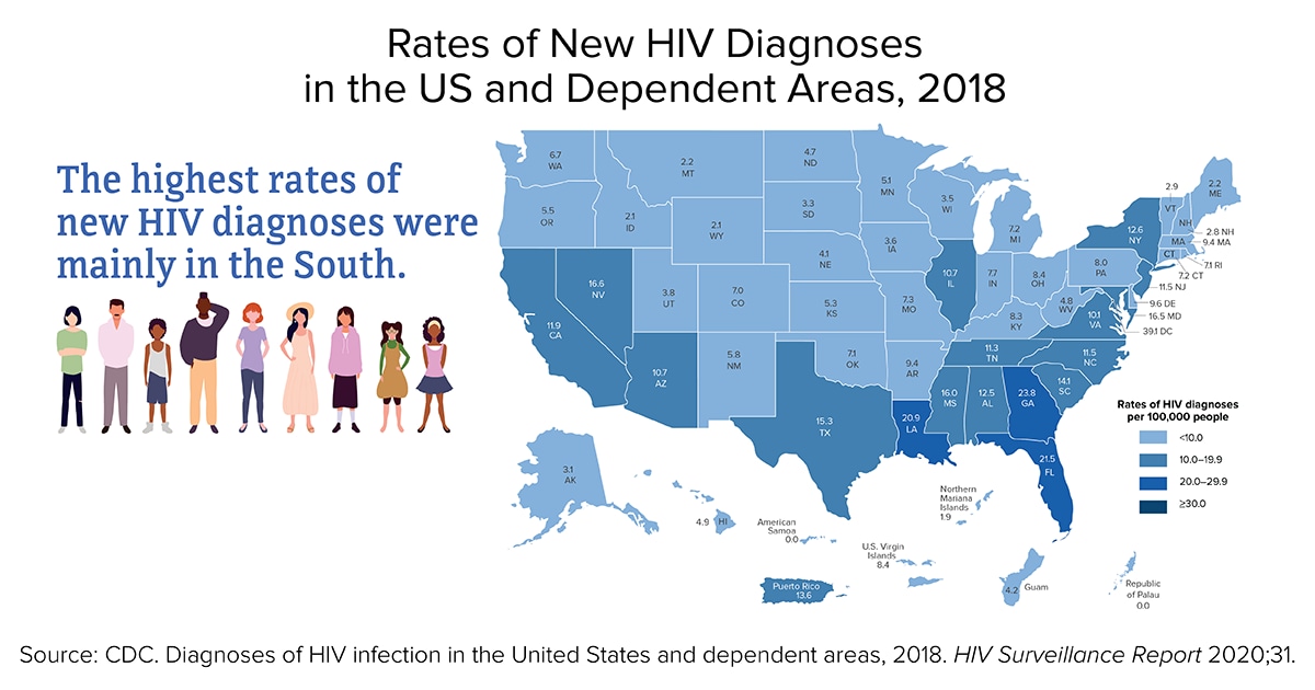
This static choropleth map displays the number of newly diagnosed HIV cases by state and U.S. territory in 2018 using the CDC’s HIV Surveillance Report data. The indices are reported in the rate of new HIV diagnoses per 100,000 residents of each state in the year 2018. The indices for this map are: <10, 10.0-19.9, 20.0-29.9, ≥30.
Infectious Diseases: 3.4 Lyme Disease
3.4.1. Lyme Disease Incidence (Centers for Disease Control & Prevention)
The website shows the prevalence of Lyme disease in the U.S. per state and county for 2019, in two separate maps. The first map is an interactive choropleth map that identifies prevalence of Lyme disease in cases per 100,000 by state. Each state is colored light green for low or dark green for high incidence. Low incidence is defined as less than 10 cases per 100,000 per year. High incidence is defined as more than 10 cases per 100,000 per year. By hovering over each state the name of the state, high or low incidence, number of confirmed and probable cases and both, the yearly incidence rate and 3-year average incidence of Lyme disease is displayed. By scrolling down the page, a dot density map can be viewed. This static U.S. map displays one dot randomly in each county for each positive county case. This allows the observer to identify clusters of cases within a state.
Infectious Diseases: 3.5 Sexually Transmitted Infections (STI)
3.5.1. Global Sexually Transmitted Infections (World Health Organization)
The World Health Organization has a searchable Global Health Observatory Map Gallery for major health topics, including sexually transmitted infections. Maps from the WHO and other sources are detailed below for the three most common sexually transmitted infections, syphilis, chlamydia and gonorrhea.
Syphilis is an easily treatable sexually transmitted infection that has the ability to cause significant morbidity and mortality. It is of particular concern because of an increased in incidence in men who have sex with men (MSM) and vertical transmission, mother to baby (Stoltey & Cohen, 2015). The WHO has a series of choropleth maps showing the prevalence of syphilis in the following population:
Percentage of Antenatal Care Attendees That Test for Syphilis at First Visit (2007-2018)
Percentage of Antenatal Care Attendee’s Positive for Syphilis (2008-2018)
Percentage of Antenatal Care Attendee’s Positive for Syphilis Who Receive Treatment (2010-2018)
Percentage of Men Who Have Sex With Men With Active Syphilis (2008-2018)
Percentage of Sex Workers With Active Syphilis (2008-2018)
Each map has color coded countries based on the index provided. The indices for positivity rates in the three populations are: <0.5, 0.5-0.9, 1-4.9, >5%. The indices for testing and treatment in the antenatal populations are: <50.0%, 50.1-89.9%, 90-94.9%, and >95%.
Chlamydia (Institute for Health Metrics and Evaluation)
Chlamydia is the most common sexually transmitted infection. If left untreated, it can lead to cervicitis, prostatitis, proctitis, and pelvic inflammatory disease, which puts women at risk for ectopic pregnancy and infertility; neonates may develop conjunctivitis or pneumonia (Mohseni et al., 2021). The choropleth map created by IHME displays the number of age-standardized DALY (Disability Adjusted Life Years) for Chlamydia infections per 100,000 inhabitants for the year 2019 by country. The indices for this map are: <0.7, 0.7-<1.3,1.3-<1.5,1.5-<1.7, 1.7-<1.8, 1.8-<2.0, 2.0-<2.2, 2.2-<2.6, 2.6-<3.1, 3.1-<5.4, >5.4.
Gonorrhea (Nature Reviews Disease Primers)
Gonorrhea is the second most common sexually transmitted infection, with an estimated global annual incidence of 86.9 million adults (Unemo et al., 2019). If left untreated gonorrhea can cause health complications such as urethritis, cervicitis, prostatitis, pharyngitis, proctitis and pelvic inflammatory disease. There is no vaccine and gonorrhea, though treatable now, has become more difficult to treat as it has become increasingly resistant to multiple drugs (Unemo et al., 2019). This map was created using WHO data. It separates the populations into the six WHO regions (Americas, African, European, Eastern Mediterranean, Southeast Asia, and Western Pacific). The map displays a pie graph for each region showing the incidence of infections in millions for adult males and females for the year 2016. An adult is defined as someone 15-49 years of age. Superimposed on each region is the World Bank income classification for each country. These classifications are: high income, upper middle, lower middle, and low income.
3.5.2. U.S. Sexually Transmitted Infections (Centers for Disease Control & Prevention)
This interactive choropleth map created by the CDC displays information about primary and secondary syphilis, early latent syphilis, congenital syphilis, gonorrhea, and chlamydia. To view these maps, select STD under the first drop down on the left-hand side labeled Disease & SDOH. Select the infection of interest in the dropdown directly below labeled Indicator. This map can be viewed using state or county statistics. The maps subjects can be filtered using gender, year, ethnicity, age group, and transmission category. By hovering over each state or county, the geographic name will appear accompanied by the incidence rate per 100,000 persons. Data is available for years 2008-2021.
Infectious Diseases: 3.6 Diarrhea
3.6.1. Global Diarrheal Deaths (Our World in Data)
This interactive choropleth map displays the number of diarrhea deaths per 100,000 people by country per year. This map uses data from Institute for Health Metrics and Evaluation (IHME) and Global Burden of Disease (GBD). This map can be filtered by world or region in the right upper corner. By hovering over each country, the name of the country, number of deaths and mini bar graph of the previous year’s mortality rates are displayed. To access additional information about each country, select the timeline or tabs at the bottom of the map. The dates range from 1990-2019. This map shows the association of the highest death rate of this disease with the world’s poorest countries. In the accompanying article, Dadonaite et al. (2019) identifies risk factors and proposes preventative interventions.
3.6.2. U.S. E. coli Outbreaks (Centers for Disease Control & Prevention)
These interactive choropleth maps display Escherichia coli (E. coli) outbreaks in the U.S. The data used for this map were collected by the CDC, National Center for Emerging and Zoonotic Infectious Diseases (NCEZID) and the Division of Foodborne, Waterborne, and Environmental Diseases (DFWED). A map for each outbreak event can be found by selecting an outbreak from the left-hand column. Outbreaks are organized by year and subdivided by source of E. coli infection. For example, in March 2021, the outbreak was caused by packaged salads, baby spinach, and cake mix. The indices for this map are based on the number of infections per state and vary with each outbreak. Click on the Data Table below the map for a drop-down list of the number of infections in each state or hover over each state to see the number of infections during that outbreak event. Data is available for years 2006 through the current date.
3.6.3. U.S. Salmonella Outbreaks (Centers for Disease Control & Prevention)
This static choropleth map created by the CDC displays Salmonella enterica incidence for the year 2021 linked to food or animal contact. Data for this map were collected by the CDC, National Center for Emerging and Zoonotic Infectious Diseases (NCEZID) and the Division of Foodborne, Waterborne, and Environmental Diseases (DFWED). The sources of the outbreaks, from 2006 to current date, are listed in a left-hand column and additional maps regarding S. enterica incidence can be accessed by dates with tabs below the map.
Infectious Diseases: 3.7 Malaria
3.7.1. Malaria Global (Our World in Data)
This interactive choropleth map uses WHO data, the Global Health Observatory Data Repository, and World Health Statistics to display the incidence of malaria. The map can be filtered by world or region in the right upper corner. The indices for this map are 0-10, 10-25, 25-50, 50-75, 75-100, 100-200, 200-300, 300-400, 400-500 and greater than 500 per 1,000 population at risk. By hovering over each country, the name of the country, number of deaths and mini bar graph of the previous year’s risk rate are displayed. To access additional information about the country and data, explore the timeline and tabs at the bottom of the map. The dates can be filtered from 2000-2020.
Infectious Diseases: 3.8 Rabies
3.8.1. Global Rabies Mortality (World Health Organization)
This World Health Organization (WHO) world map displays the global burden of dog-transmitted human rabies mortality by country using data from 2017. There are two static choropleth maps displaying rabies mortality per country. The first map is in human deaths per year by country. The indices are under 4.5, 4.5-20, 20-90, 90-400, 400-1800, 1800-8100, and over 8100. The second map displays human deaths per 100,000 people. The indices are under 0.0024, 0.0024-0.038, 0.038-0.19, 0.19-0.6, 0.6-1.5, 1.5-3, and over 3. While some countries are free from canine rabies, the percentage of rabies mortality is likely grossly under reported.
3.8.2. U.S. Rabies distribution (Centers for Disease Control & Prevention)
A choropleth map shows the distribution of rabies in wild animals in the US for 2018. The variables were bat, skunk, racoon, fox, and mongoose. Data were collected from the CDC Rabies Surveillance in the US during 2018 (Ma et al., 2020). This article has detailed choropleth static maps that display the distribution of animals that were tested for rabies in the US in 2018 by county. There are individual maps for bats, raccoons, skunks, foxes, domesticated cats and domesticated dogs. These can be found by scrolling down to the subheading of the animal of interest. The legend displays a color for each county based on the number of animals that were tested in 2018. A red dot represents an animal that tested positive for rabies in that county.
There have been 25 cases of human rabies diagnosed in the US from 2009-18. Seven of the rabies cases were acquired outside of the US (Centers for Disease Control and Prevention, 2021a). A map of human cases of rabies is not available because of the low and widespread incidence of rabies in the US.
Infectious Diseases: 3.9 Fungal
3.9.1. Histoplasmosis, Coccidioidomycosis (Valley Fever) and Blastomycosis US and Global (Centers for Disease Control & Prevention)
These static U.S. and global maps show the distribution of Histoplasmosis, Coccidioidomycosis (Valley Fever) and Blastomycosis, infectious diseases caused by inhalation of fungus from the environment. The data used to determine the distribution patterns of these fungal infections were taken from skin-testing done in the 1940 and 1950s, outbreaks of each disease, public health surveillance data, and subject expertise. There are between two and four maps for each of these three fungal diseases. Each has an isopleth map of the US distribution of the fungus and an isopleth map of the global distribution of each fungus. Histoplasmosis and Coccidioidomycosis (Valley Fever) have additional maps with data regarding cases and disease outbreaks. The world maps and data are all from “Re-drawing the Maps from Endemic Mycoses” (Ashraf et al., 2020). The US maps are from CDC and references provided on each website.
This set of maps display histoplasmosis infections in the US and the world. The first choropleth map displays cases related to histoplasmosis outbreaks from an event for the years 1938-2013. The map has indices of the number of outbreak related cases per state: <12, 12-49, 50-143, and >143. In addition, this first map displays the location of outbreaks with a dot. The second choropleth map displays the number of cases per county for the years 2011-2014 and number of cases per 100,000 people and indices are: no cases, 0.01-0.73, 0.74-1.57, 1.58-3.2, and >3.2. The third choropleth map displays Histoplasma suitability by county in the United States. Histoplasma suitability is based on a mathematical equation using soil acidity, distance from water and land cover. The indices for suitability are: <0.01, 0.01-5.3, 5.3-5.4, 5.4-5.7, 5.7-5.8, 5.9-6.1, 6.1-6.4, 6.4-6.9, and 6.9-7.5.
Coccidioidomycosis (Valley Fever)
This set of static isopleth maps show the distribution of Coccidioidomycosis (Valley Fever) in the US and the world. The map of global distribution displays the most likely places that coccidioidomycosis inhabits. The third map shows the U.S. distribution of the 40 outbreaks of coccidioidomycosis from 1940-2015 using dots. The fourth map displays the average incidence of coccidioidomycosis per 100,000 persons from 2011-2017 by county. The indices for this map are: 0, 0.1-5.9, 6.0-20.9, 30-50.9, 51-99.9, >100.
This set of static isopleth maps show the distribution of Blastomycosis in the US and the world. The map of global distribution of blastomycosis displays the most likely places that blastomycosis inhabits and more information is available about the quality of data of blastomycosis occurrence.
Infectious Diseases: 3.10 Tuberculosis
3.10.1. Global Tuberculosis Mortality (Our World in Data)
This interactive choropleth map uses Global Burden of Disease (GBD) and Institute for Health Metrics and Evaluations (IHME) data to display the prevalence of death from tuberculosis in mortality rate per 100,000 people per year by country. This map can be filtered by world or region in the right upper corner. By hovering over each country, the name of the country, number of deaths, and mini bar graph of the previous year’s mortality rate are displayed. To access additional information about the country and data, explore the timeline and tabs at the bottom of the map. The dates can be filtered from 1990-2019.
3.10.2. U.S. Tuberculosis (Centers for Disease Control & Prevention)
This series of four choropleth maps created by the CDC display the incidence of tuberculosis (TB) in cases per 100,000 residents for the year 2019. The maps are divided into overall incidence of TB, incidence of TB in U.S.-born persons, incidence of TB in non-U.S. born persons and TB incidence among U.S. born non-Hispanic Black and African American persons. The indices for these maps are in relation to the public health target goal for 2025. The three indices are: “Met 2025 target, Above 2025 target but at or below national average, and Above national average.”
Cancers: 4.1 Cancer
4.1.1. Global Cancers (Pulitzer Center)
This interactive choropleth map was created using data from GloboCan 2008, World Bank and United Nations Development Programme (UNDP). This map displays cancer rates for: all cancers and specifically breast, cervical, liver, lung, prostate and stomach cancers. This information is displayed by incidence (new cases) and mortality (deaths) per 100, 000 residents by country. The indices per incidence of 100,000 residents for all cancers are: >0, >60, >120, >180, >240, >300. The indices per mortality of 100,000 residents for all cancers are: >0, >30, >60, >90, >120, >150. The indices for types of cancer, incidence and mortality differ for each map. By hovering over each country, the name of the country, the rates of death/incidence of cancer, Human Development Index (HDI), GDP per capita, Health expenditures per capita, and Life Expectancy are given.
4.1.2. U.S. Cancers (Centers for Disease Control & Prevention)
These interactive choropleth maps display the rate of new cancers diagnosed, rate of cancer deaths, number of total cancers diagnosed and number of cancer deaths, in the U.S. for the years 2014-2019 and 2019 alone. These maps can be filtered by sex, type of cancer, year, and race and ethnicity. Data are reported on the rate of new cancers diagnosed or cancer deaths per 100,000 persons by state. The indices change for each map. By hovering over each state, the name of the state, the rate of incidence, confidence interval and total number of cases per year are displayed. Additional maps available are for cancer rate and number for each state by county and cancers grouped by risk factor. The cancer rate for each state can be found under the drop-down menu for the tab Geography on the horizontal toolbar at the top of the screen. Maps for cancers grouped by attributable risk factors can be found on the drop-down menu on the tab Special Analysis on the right side of the horizontal toolbar at the top of the screen. Attributable risk factors listed are alcohol, Human Papillomavirus (HPV), obesity, physical inactivity and tobacco. The data used to create this map was taken from the U.S. Cancer Statistics and the CDC’s National Center for Health Statistics, National Vital Statistics System.
Chronic Diseases: 5.1 Cardiovascular
5.1.1. Global Cardiovascular Disease (Our World in Data)
This interactive choropleth map uses International Health Metrics and Evaluation (IHME) and Global Burden of Disease (GBD) data to display the prevalence of the cardiovascular death rate per 100,000 people per year by country. This map can be filtered by world or regions in the right upper corner. The indices for this map are 0-100, 100-150, 150-200, 200-300, 300-400, 400-500, 500-600, and 600-800 deaths. By hovering over each country, the name of the country, number of deaths and mini bar graph of the previous years’ mortality rate are displayed. To access additional information about the country and data, explore the timeline and tabs at the bottom of the map. The dates range from 1990-2019.
5.1.2. U.S. Cardiovascular Disease (Centers for Disease Control & Prevention)
This choropleth map is named the Interactive Atlas of Heart Disease and Stroke and can be viewed by county or state levels. Once launched, the map has information about cardiovascular disease incidence and also includes data regarding geographic area, heart disease and stroke risk factors, social and economic data, health care delivery and insurance, and health care costs. All data is displayed as a component per 100,000 persons. The map has numerous filters and various models to display the data including creating a comparison map, creating a second map, creating map displays over time, producing pdf documents, and layering the map with GIS data. The menu bar (three lines) on the left-hand side, below the map title, allows the user to filter the map by type of data. The top navigation panel houses the icons used to create the map models and overlay features.
Each map display icon has a drop-down menu that includes a help video/tutorial on how to use each feature. A tutorial on general map creation and citation information is available by clicking the “i” or “movie camera” icon in the upper right-hand corner of the menu bar on the left side of the screen. Data were gathered from extensive sources in order to create a variety of maps using this Interactive atlas program. To access the sources for these maps, scroll down to the icon labeled “Data Sources” on the right-hand column below the map (Centers for Disease Control and Prevention, 2021b).
Chronic Diseases: 5.2 Diabetes
5.2.1. Global Diabetes Rate Change (Our World in Data)
This interactive choropleth map was created using data from the International Diabetes Federation and Diabetes Atlas. The map displays prevalence of type 1 and 2 Diabetes by percentage for people aged 20-79 years by country from 2000 and 2021. This map can be filtered by world or regions in the right upper corner, and the map indices are: 0-2%, 2-4%, 4-6%, 6-8%, 8-10%, 10-12.5%, 12.5-15%, 15-17.5%, 17.5-20%, and 20->25%. By hovering over each country the name of the country, percentage of diabetes prevalence and year data were collected are displayed. To access additional information about the country and data, explore the timeline and tabs at the bottom of the map.
5.2.2. Global Diabetes Prevalence (World Mapper)
This cartogram map uses 2017 data from Diabetes Atlas to display the proportion of adults in each country with diabetes with an adult defined as 18 years of age or older. The map distorts regions of the global map by an average of the percentage of individuals diagnosed with diabetes per population within that region. By clicking on the Colour Key at the bottom right-hand corner of the map the legend identifies the geographic regions by their corresponding color. The data used to create this map can be accessed by clicking on the red text “download data file“ in the technical notes section on the right-hand column of the page.
5.2.3. Global Diabetes Expenditure (World Mapper)
This cartogram map uses 2017 data from Diabetes Atlas to display the amount of global mean diabetes expenditure per adult in U.S. dollars. The map distorts the global regions in proportion to the amount of money spent on diabetes care. By clicking on the Colour Key at the right-hand corner below the map, the legend identifies the regions and their corresponding color. The data used to create this map can be accessed by clicking on the red text “download data file” in the technical notes section on the right-hand column of the page.
5.2.4. U.S. Diabetes Prevalence (Centers for Disease Control & Prevention)
This diabetes prevalence report displays a series of static choropleth maps using data from the U.S. Diabetes Surveillance System and the Behavioral Risk Factor Surveillance System. These maps display diabetes prevalence in the US for adults over the age of 19 by county for the years 2004, 2012, and 2019. The prevalence is given in the percentage of the population diagnosed with diabetes. These maps can be found by scrolling to the bottom of the webpage.
Chronic Diseases: 5.3 Asthma
5.3.1. Global Asthma (Our World in Data)
This interactive choropleth map displays asthma prevalence annually by country per year. This map can be filtered by world or regions in the right upper corner. The indices for this map are in the percentage of asthma prevalence: 0-2%, 2-4%, 4-6%, 6-8%, 8-10%, 10-12%, and 12-14%. By hovering over each country the name of the country, percentage of the population with asthma, and a mini bar graph of the previous year’s percentages of asthma prevalence will be displayed. To access additional information about the country and data, explore the timeline and tabs at the bottom of the map. The dates range from 1990-2019. Data are from a 2019 Global Burden of Disease and 2021 Institute for Health Metrics and Evaluation studies.
5.3.2. U.S. Asthma (Center for Disease Control & Prevention)
Asthma Prevalence of Children Ever Diagnosed With Asthma and Currently Have Asthma (2011 and Onward)
These interactive choropleth maps created by the CDC are displayed using the National Environmental Public Health Tracking System Query Tool. The data used were from the Behavior Risk Factor Surveillance System (BRFSS). The BRFSS data are self-reported via telephone survey. The “Content Area” or topic choices to map were Asthma Prevalence for Adults and Children in the US by state from 2011-2019. The indices are in percentages of the population ever diagnosed with asthma for 2011-2019. For adults in 2019, indices are: 6.2-8.2%, >8.2-8.9%, >8.9-9.6%, 9.6-10.4%, >10.4-13.2%. For children in 2019, indices are: 4.3-7.0%, >7.0-7.9%, >7.9-8.8%, >8.8-10.2%, >10.2-16%. Additional asthma maps can be found by clicking on the “Filter Data” icon in the upper left-hand corner of the map. These maps include Emergency Department visits for asthma and Asthma hospitalizations. The results can also be filtered for age, gender, group, race, and race ethnicity. By hovering over each state, the name of the state and percentage of the population with asthma is displayed.
Chronic Diseases: 5.4 Multiple Sclerosis
5.4.1. Global Multiple Sclerosis (MS Net)
These two infographics were created from a static choropleth world map that displays the prevalence of multiple sclerosis, a common inflammatory neurological disease. The data are displayed in cases per 100,000 people. The indices used are: 0 to <30, 30 to <60, 60 to <120, 120 to <150, 150 to <300. The original map and data can be viewed in an article titled, A global, regional, and national systematic analysis of multiple sclerosis from 1990-2016 (Wallin et al., 2019, p. 281).
Psychiatric Disorders: 6.1 Suicide
6.1.1. Global Suicide (Our World in Data)
Our World in Data created four interactive choropleth maps to display suicide rates and one map regarding data validity. The first three maps can be filtered by world or regions in the right upper corner and provide a view of change over time. Also, by hovering over each country, the name of the country, the number of suicides per 100,000 individuals of the total population and a mini bar graph of previous years number of suicides are given.
The first global map shows the percentage of suicides as a proportion of a nation’s total deaths by year from 1990-2019. The second map displays the suicide deaths per 100,000 individuals with indices of: 0-5, 5-10, 10-15, 15-20, 20-40, 40-50, and 50-100, from 1990-2019. Scrolling farther down the page are world maps that display the male to female ratios of suicide, 1990-2017, and each country’s suicide rate by firearms, 1990-2019.
The third map, Suicide by Gender, displays the ratio of male to female suicides per country. An index greater than one indicates higher suicide rates in men. The fourth map, Suicide Rate by Firearm, displays the number of suicides from firearms per 100,000 people per country. The last map shows the quality of suicide mortality data due to chronic under reporting of suicide globally.
These maps incorporate data from the Health Metrics and Evaluation (IHME) and Global Burden of Disease (GBD). To access additional information about the sources, country and data, explore the timeline and tabs at the bottom of each map.
6.1.2. U.S. Suicide Rate Change (Centers for Disease Control & Prevention)
This static choropleth map and infographic displays change in rate of suicide from 1999-2016 using data collected from the CDC’s National Vital Statistics System. The percentage of change was displayed in the rate of increase or decrease. The data used to create this map were from the CDC’s National Vital Statistics System. The indices are percent of increase: 1%, 6-18%, 19-30%, 31-37%, and 38-58%.
6.1.3. U.S. Suicide Prevalence in the US (National Institute for Health)
Recognizing the high prevalence of suicide deaths in the US within a global context, this choropleth map highlights latest CDC data for this major public health concern. Given that state populations and age distributions vary, this map is age adjusted suicide rates by state. The map, Figure 4, is found by scrolling halfway down the page. Indices are in suicides per 100,000 population. This map is created using the CDC’s Web-based Injury Statistics Query and Reporting System (WISQARS™) based on the National Survey on Drug Use and Health (NSDUH) data. This extensive online database is available to the public health professionals, researchers and media.
Psychiatric Disorders: 6.2 Depression
6.2.1. Global Depression (Institute for Health Metrics and Evaluation)
The Institute for Health Metrics and Evaluation have created a mapping tool that displays global depression data. Data on depression can be filtered with the tool bar on the left column of the map screen. The data can be filtered by measure (deaths, years lived with disability, disability-adjusted life years), year (1990-2019), age, sex, unit (number, rate, percentage), rate of change and detail. The indices are different for each map and can be adjusted on a horizontal bar at the bottom of the screen. There is a comparison view at the top left sided tool bar. Share and Download icons are available on the right side of the horizontal toolbar at the top of the map. Global Burden of Disease data were used to create these maps.
6.2.2. U.S. Depression (Centers for Disease Control & Prevention)
Age-Standardized Percentage of Adults Meeting Criteria for Current Depression, By State/Territory
This static choropleth map produced by the CDC in the Morbidity and Mortality Weekly Report (MMWR) displays depression in the United States in 2006, 2008 with data collected in the Behavior Risk Factor Surveillance System (BRFSS). The indices for this map were reported in the percent of population meeting current criteria for depression: 4.8-7.0%, 7.1-8.3%, 8.4-9.1%, 9.2-10.3%, 10.4-14.8%. The map can be found by scrolling down the bottom of the article.
This static choropleth map of adolescents with at least one major depressive episode (MDE) in the surveyed year was produced by the Center for Behavioral Health Statistics and Quality. The data used were taken from the National Survey on Drug Use and Health, 2013-2014. The indices for this map are displayed in percentages of adolescents reporting an MDE event: 8.69-9.92%, 9.93-10.46%, 10.47-11.11%, 11.12-11.95%, 11.96-14.62%. The map can be found by scrolling down part way through this short report.
Psychiatric Disorders: 6.3 Dementia
6.3.1. Global Dementia Deaths (Our World in Data)
This interactive choropleth map displays the number of deaths secondary to Alzheimer and dementia by country per year. Data are sourced from the Global Burden of Disease Collaborative Network (GBD) and the Institute for Health Metrics and Evaluation (IHME) for the years 1990-2019. This map can be filtered by world or regions in the right upper corner. By hovering over each country, the name of the country, the number of deaths and a mini bar graph of previous years’ deaths from Alzheimer’s and dementia are displayed. To access additional information about each country and data, explore the timeline and tabs at the bottom of the map.
6.3.2. U.S. Dementia Prevalence (Centers for Disease Control & Prevention)
This set of five static choropleth maps from the CDC focus on subjective cognitive decline for adults 45 years and older. This self-reported cognitive impairment is an early symptom of dementia and Alzheimer’s disease. The CDC article explains the decline in brain cognition and provides questions asked of participants. State data were compiled using the Behavioral Risk Factor Surveillance System (BRFSS) from 2015-2017. Indices for the Prevalence of Subjective Cognitive Decline in the U.S. are: 5.3-9.4%, 9.5-10.7%, 10.8-12.0%, and 12.1-16.3%. This the first map is followed by maps of: Percent of Adults Living Alone with Subjective Cognitive Decline, Percent of Adults with Subjective Cognitive Decline, who discussed their symptoms of memory loss and confusion with a healthcare professional, Percent of Adults with Subjective Cognitive Decline who report Coronary Heart Disease or Stroke, and Health Status of Caregivers: Prevalence of Coronary Heart Disease and/or Stroke.
References
Aber, S. E. W., & Aber, J. W. (2017). Map librarianship: A guide to geoliteracy, map and GIS resources and services. Chandos Publishing/Elsevier.
Altman, N., & Krzywinski, M. (2015). Association, correlation and causation. Nature Methods, 12, 899–900. https://doi.org/10.1038/nmeth.3587
Arias, E., Tejada-Vera, B., Ahmad, F., & Kochanek, K. D. (2021). Provisional life expectancy estimates for 2020. Vital Statistics Rapid Release, 15. https://doi.org/10.15620/cdc:107201
Ashraf, N., Kubat, R. C., Poplin, V., Adenis, A. A., Denning, D. W., Wright, L., McCotter, O., Schwartz, I. S., Jackson, B. R., Chiller, T., & Bahr, N. C. (2020). Re-drawing the maps for endemic mycoses. Mycopathologia, 185(5), 843–865. https://doi.org/10.1007/s11046-020-00431-2
Blauer, B. (2021). Filling in the map of COVID-19 demographic data. Johns Hopkins Coronavirus Resource Center. https://coronavirus.jhu.edu/pandemic-data-initiative/data-outlook/filling-in-the-map-of-covid-19-demographic-data
Bojko, A. (2009). Informative or misleading? Heatmaps deconstructed. In J.A. Jacko (Ed.). Human-computer interaction: New trends (pp. 30-39). Springer-Verlag. https://doi.org/10.1007/978-3-642-02574-7_4
Centers for Disease Control and Prevention. (2017). Tips for creating maps for public health: Cartographic guidelines for public health. https://www.cdc.gov/dhdsp/maps/gisx/resources/tips-creating-ph-maps.html
Centers for Disease Control and Prevention. (2018). HRQOL concepts. https://www.cdc.gov/hrqol/concept.htm
Centers for Disease Control and Prevention. (2021a). Human rabies. https://www.cdc.gov/rabies/location/usa/surveillance/human_rabies.html
Centers for Disease Control and Prevention. (2021b). Data sources. https://www.cdc.gov/dhdsp/maps/atlas/data-sources.html#dataControls
Centers for Disease Control and Prevention. (2022). CDC COVID Data tracker. https://covid.cdc.gov/covid-data-tracker/#vaccination-case-rate
Dadonaite, B., Ritchie, H., & Roser, M. (2019). Diarrheal diseases. Our World in Data. https://ourworldindata.org/diarrheal-diseases
Drope, J. (2022, May 18)). Key takeaways from the launch of the Tobacco Atlas 7th edition. Vital Strategies and Tobacconomics, University of Illinois Chicago. https://tobaccoatlas.org/key-takeawys-from-the-launch-of-the-tobacco-atlas-7th-edition
Field, K. (2020, February 25). Mapping coronavirus, responsibly. ArcGIS Blog. https://www.esri.com/arcgis-blog/products/product/mapping/mapping-coronavirus-responsibly/
Jarcho, S. (1945). Equal-area projections and the azimuthal equidistant projection in maps of disease. American Journal of Public Health and the Nation’s Health, 35(10),1005-1013. https://www.ncbi.nlm.nih.gov/pmc/articles/PMC1625711/
Leonhardt, D. (2021, July 22). Life expectancy, falling. The New York Times. https://www.nytimes.com/2021/07/22/briefing/life-expectancy-falling-covid-pandemic.html
Lissak, G. (2018). Adverse physiological and psychological effects of screen time on children and adolescents: Literature review and case study. Environmental Research, 164, 149-157. https://doi.org/10.1016/j.envres.2018.01.015
Ma, X., Monroe, B. P., Cleaton, J. M., Orciari, L. A., Gigante, C. M., Kirby, J. D., Chipman, R. B., Fehlner-Gardiner, C., Cedillo, V. G., Petersen, B. W., Olson, V., & Wallace, R. M. (2020, January 15). Public veterinary medicine: Public health: Rabies surveillance in the United States during 2018. Journal of the American Veterinary Medical Association, 256(2), 195-208. https://doi.org/10.2460/javma.256.2.195
Mohseni, M., Sung, S., & Takov, V. (2021, December 12). Chlamydia. NIH: StatPearls. https://www.ncbi.nlm.nih.gov/books/NBK537286/
Musa, G. J., Chiang, P. H., Sylk, T., Bavley, R., Keating, W., Lakew, B., Tsou, H. C., & Hoven, C. W. (2013). Use of GIS mapping as a public health tool—From cholera to cancer. Health Services Insights, 6, 111–116. https://doi.org/10.4137/HSI.S10471
MyLifeElsewhere. (n.d.). Size of the United States compared to Greenland. https://www.mylifeelsewhere.com/country-size-comparison/united-states/greenland
National Institute of Health. (n.d.). Calculate your BMI - standard BMI calculator. National Heart Lung and Blood Institute. https://www.nhlbi.nih.gov/health/educational/lose_wt/BMI/bmicalc.htm
Nelson, J. (2017, May 4). Happy maps. ArcGIS Blog. https://www.esri.com/arcgis-blog/products/arcgis-online/analytics/happy-maps/?rmedium=redirect&rsource=blogs.esri.com/esri/arcgis/2017/05/04/happy-maps
Neta, G., Brownson, R. C., & Chambers, D. A. (2018). Opportunities for epidemiologists in implementation science: A primer. American Journal of Epidemiology, 187(5), 899-910. https://doi.org/10.1093/aje/kwx323
Porter, R. M., Tindall, A., Gaffka, B. J., Kirk, S., Santos, M., Abraham-Pratt, I., Gray, J., Heckler, D., Ward, W. L., Tucker, J. M., & Sweeney, B. (2018). A review of modifiable risk factors for severe obesity in children ages 5 and under. Childhood Obesity, 14(7), 468-476.
Roser, M., Ortiz-Ospina, E., & Ritchie, H. (2013-2019). Life expectancy. Our World in Data. https://ourworldindata.org/life-expectancy
Roser, M., & Ritchie, H. (2019). Hunger and undernourishment. Our World in Data. https://ourworldindata.org/hunger-and-undernourishment
Soetens, L., Hahné, S., & Wallinga, J. (2017, June 29). Dot map cartograms for detection of infectious disease outbreaks: An application to Q fever, the Netherlands and pertussis, Germany. Eurosurveillance, 22(26),30562. https://doi.org/10.2807/1560-7917.ES.2017.22.26.30562
Statista. (2022, March). Leading causes of death U.S. 2020-2022. https://www.statista.com/statistics/1254560/leading-causes-of-death-in-the-us-average-number-daily/
Stoltey, J. E., & Cohen, S. E. (2015). Syphilis transmission: A review of the current evidence. Sexual Health, 12(2), 103–109. https://doi.org/10.1071/SH14174
Unemo, M., Seifert, H. S., Hook, E. W. III, Hawkes, S., Ndowa, F., & Dillon, J. A. R. (2019). Gonorrhoea. Nature Reviews Disease Primers, 5, 1-23. https://www.nature.com/articles/s41572-019-0128-6
United Nations. (2017). World happiness report. https://worldhappiness.report/ed/2017/
United Nations. (2021). World happiness report. https://worldhappiness.report/ed/2021
Wallin, M. T., Culpepper, W. J., Nichols, E., Bhutta, Z. A., Gebrehiwot, T. T., Hay, S. I., Khalil, I. A., Krohn, K. J., Liang, X., Naghavi, M., Mokdad, A. H., Nixon, M. R., Reiner, R. C., Sartorius, B., Smith M., Topor-Madry, R., Werdecker, A., Vos, T., Feigin, V. L., & Murray, C. J. L. (2019). Global, regional, and national burden of multiple sclerosis 1990-2016: A systematic analysis for the Global Burden of Disease Study 2016. The Lancet Neurology, 18(3),269-285. http://dx.doi.org/10.1016/S1474-4422(18)30443-5
Wartenberg, D. (2003). Disease mapping: A renewed opportunity for epidemiologic investigation. Epidemiology,14(5), S85. https://journals.lww.com/epidem/Abstract/2003/09001/DISEASE_MAPPING__A_RENEWED_OPPORTUNITY_FOR.198.aspx

This work is licensed under a Creative Commons Attribution-NonCommercial 4.0 International License.
Issues in Science and Technology Librarianship No. 100, Spring 2022. DOI: 10.29173/istl2694